Thursday, March 22, 2012

My Home


A little while ago I had the pleasure of inviting Sydney stylist/photographer team
Warnes and Walton, into my home for a very interesting day.  The duo were on a quick jaunt to Queensland in search of interesting interiors to photograph. 
 And I must say that I was delighted that they chose my home as one of them.

I have to say that it was such an interesting and educational experience having my interior 'styled' by someone else as opposed to doing it myself.  It really is quite therapeutic having fresh eyes coming into your home to give it a bit of a shakeup or just put a slightly different slant on things.

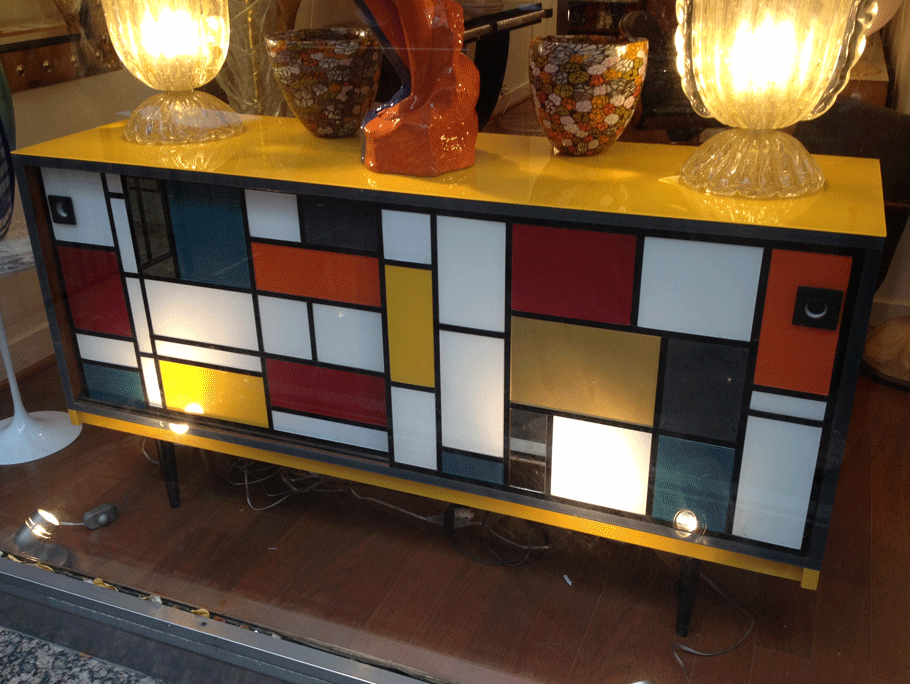
 From the moment Natalie Walton arrived, I was fascinated by the way she quietly and methodically went from room to room, finding various items that in some cases I had even forgotten I had.  Area rugs were swapped around in order to create a lighter more summery feel for the photo in my 'Sitting Room' area, some artwork was changed around, an old vintage Peacock chair left over from my Babalou project was dragged out of the garage, and the overall look of the interior was pared back a little.

Natalie, who is an accomplished writer, blogger, and interior stylist, whose work has appeared in everything from Elle Decoration UK, Australia's Harpers Bazaar, Real Living, to House and Garden, knew exactly the mood she was going for. An understated, casual, eclectic vibe which really captured the essence of my home and garden, and I think a quintessentially Australian/Queensland style.

 Her friendly colleague, photographer Chris Warnes, who has worked extensively throughout Australia and North America, made me feel so at ease and comfortable, in front of the camera.  The beautiful photos that they produced of my home, are testament to their collectively discerning eye and talent, and obviously how well they work together.

I also loved that I learnt new terminology (for me anyway) about setting up a shot.  There is always one particular 'hero' that a photo should encapsulate.  Being the collector that I am, I find myself often fighting the 'maximalist' from within.  I could sometimes be accused of having too many 'heroes' in one room.  Alas,  it is sometimes just as difficult to edit as it is to add!!

Natalie and Chris have put together a lovely feature and we were very pleased to see that it made the cover of the autumn issue of  Queensland Homes magazine which is out now.

We all spent a lovely day together, and Natalie who was at the time many weeks pregnant,
 just a few days later got on a plane and flew to L.A to interview
  Kelly Wearstler for Australian Harpers Bazaar!


Now that's what I call motivation!!!


Here are a few pics of the magazine


Interior Design

Styling & Photography


as seen in

 Autumn Issue 2012 Queensland Homes out now


words J Watson-Evans


posted by


THE DECORATOR

Saturday, March 17, 2012

Chandelier Finds its Home!


A home really is an ongoing project. 
 And sometimes you really do have to wait until 
the 'real' thing comes along!

Do you remember a while back when I was trying to find a home for this incredible
 1950's Italian Chandelier that was saved from a long ago demolished hotel? 


Well I am pleased to inform you it has found its way to one of my lovely clients homes.
A beautiful beachfront home with an incredible central void that spans three levels.


In situ
This is just the kind of space that this extraordinary vintage chandelier of such incredible scale and distinction needed.

My client, the beautiful Karin had waited so patiently for just the right piece to come along. Finding the right piece for this particular project, with its dynamic drop, was not easy. 
 And the bare bulb was certainly not doing this space justice.
  

I am so pleased I was able to find this lovely beauty a home at last!

It was definitely worth the wait.

words J Watson-Evans

Wednesday, March 14, 2012

Mondrian Boogie Woogie

Composition in Red, Yellow & Blue 1930

Broadway Boogie Woogie (detail) 1942/1943

Mondrian inspired dress by YSL


Vintage Mondrian inspired buffet (MyVibeMyLife)

Gerrit Rietveld iconic 'Red & Blue' chair 1923


Mondrian Maximalism

Leggo construction


The Eames House Pacific Pallisades


Composition 10 1939-1942

My Mondrian inspired Converse


Saturday, March 10, 2012

Saturday Morning Vintage

I think you all know how much I love my vintage decorating books.  I just love to flick through and caress the pages of these wonderful finds. 
 I get truly inspired by these books and marvel at how much the styling has been rehashed and revitalised over the years by some of the world's leading taste makers.  
And it goes to show that good decorating, design, 
and styling does not have a 'use-by' date.

It is hard to believe that some of these pages are in fact,
 getting to be around 60 years old.
Thank goodness there are people who truly look after their books.  It is wonderful to think that these same books have somehow made their way into my life, across the seas and through the air, all the way to my library shelves.

 I really love the 'look' of some of the photography from this period.  Is it because they were all shot on 'film'? 
 Indeed I was interested to recently read in one of my favourite shelter magazines, London's seminal 'The World of Interiors',
 that they still to this day shoot their work on film.

However, with time does come progress. This morning after taking some photos on my digital Canon G11 and uploading them,
 I found myself fiddling with the special effects editing.

This photo of my sunny sitting room which is where I enjoy my morning espresso each day with my husband, and often find myself flicking through one of my aforementioned tomes, has had the treatment!

This started out to be a 'sunny Saturday morning snap' and has morphed into something which looks like it belongs in one of my old books.

What do you think?


Before
Before


After


After


These pics also fit into the 'Yellow Makes Me So Happy' category. 
 I must thank my lovely friend Julianne for sending me the very 'sunny' bunch of gerberas which really were the impetus for this little story today.

images by J Watson-Evans

Wednesday, March 7, 2012

Yellow & Blue Make Me So Happy!


You know how I really do rate the Series 7 chair by Arne Jacobsen, as the most iconic chair of the 20th Century?
Floral throw by Olivier Desforges

  Well here it is in my daughter's room in white against the dark navy blue walls. I have a number of these chairs used for dining and occasional chairs all over my home.
 I have dark brown stained ones from the early 1970's, white ones from the 1980's and cherry red gloss examples from this decade. 

 They are unbeatable for their comfort and practicality.  In my view the Series 7 will compliment any interior, and can be stacked for easy storage.

  I am also obsessed with yellow and the yellow ceramic piece on the bedhead is one of a pair of wonderful 
Italian 1970's pendant lights which have since been installed as hanging bedside lights.


Australian stylist Marcus Hay obviously feels the same way about the chair and the colours....yellow and blue. 
 Below are a few pics from his Manhattan apartment as featured in Elle Decoration.


Salon hang of 1950's & '60's  pieces including Italian calendar and metal fish sculpture.
The empty frame is also an interesting addition.
Interesting salon hang of found objects

Vignette with found objects and pieces of Italian Bitossi Pottery

Love the way the old doors have been used as a way of delineating a dining area by providing a back drop in a very small space

images via Elle Decoration

&
J Watson-Evans for WWID


LinkWithin

Related Posts Plugin for WordPress, Blogger...